TL;DR
Color transforms cramped studios into spacious, personal sanctuaries. Strategic palettes, color zoning, and visualization tools create visual flow, highlight living zones, and turn any studio into a comfortable, inviting home. Smart color choices truly make a real difference in how both owners and renters experience and market small apartments.
Why Color Is the Unsung Hero of Small Studios

Color zoning and layered palettes demonstrate smart color strategies for aphantasia apartments, essential visualization tools for small studio design.
If you've ever struggled to make a small studio apartment feel open, stylish, or truly yours, you're not alone. The most common advice is to use white walls and limit décor, but all-white can leave spaces feeling bland, not bigger.
The simplest way to make a small studio apartment feel bigger is to use strategic color zoning, cohesive palettes, balanced contrast, and layered lighting. Together, these design techniques create visual depth, improve flow, and make compact spaces feel more open and personalized. The simple answer is that thoughtfully chosen color creates both visual space and unique personality. Color zoning, layered palettes, and lighting visually expand rooms, organize open layouts, and give every corner a sense of purpose. According to our guide on small space design ideas that make your home feel bigger, how you use color is just as important as square footage itself.
-
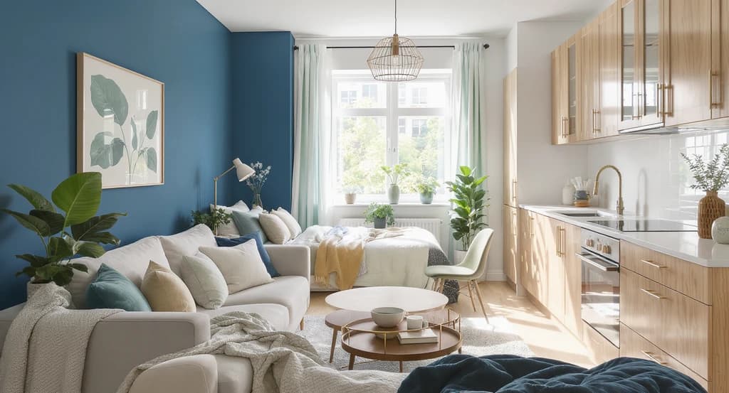
1. Use Color Zoning to Define Spaces

Color zoning strategies help aphantasia apartments and small studios visualize purposeful layouts, using distinct palettes to clarify zones without partitions.
Interior designers often use color zoning in studio apartments because it creates visual boundaries without sacrificing valuable floor space. In spaces where sleeping, working, and dining all happen in one room, strategic color becomes one of the most effective organizational tools available. A sage green wall behind the bed or a navy accent for your workspace can make zones feel distinct, no partitions needed. Colorful area rugs can anchor each function clearly as well.
This strategy brings order, reduces distractions, and helps each activity feel intentional, promoting both comfort and productivity. For actionable inspiration, see our step-by-step plan for small apartment living room layouts. -
2. Stick to Harmonious Palettes for Visual Calm
Too many different hues can make a small studio feel jumbled and crowded. Instead, choose a harmonious palette, perhaps emerald green as the main color with gentle neutrals. The classic 60-30-10 rule (main, secondary, accent) ensures the space feels unified and inviting.
As highlighted in our kitchen color guide, cohesive palettes also help adjacent spaces flow together, supporting the illusion of openness. -
3. Go Bold, But Balance With Neutrals

Color strategies for aphantasia apartments: bold accent pieces like a teal chair and mustard pillows energize small studios, while pale gray and white furniture keep the space balanced and visually expansive.
A strategic burst of mustard, teal, or coral can energize a studio, but too many bold colors reduce usable space. Use strong hues for accent elements like throw pillows or a chair, then anchor with substantial pieces in white or pale gray.
This 'statement plus grounding' approach maintains a fresh, uncluttered vibe, letting personality shine without closing things in. As shown in the same kitchen color roundup, the right accent transforms the mood and breathes life into small floorplans. -
4. Let Furniture Tell a Color Story
Furniture is extra important in compact spaces. Instead of defaulting to black or beige, consider a velvet teal sofa, coral accent chair, or green headboard. Since every item is visible, allow these pieces to set the mood for each living 'zone'.
Thoughtful color selection in major furniture streamlines your décor, expressing personality while keeping clutter to a minimum. This is one of the simplest ways to reinforce function and comfort in any apartment. -
5. Layer Textures to Deepen the Palette

Layering texture—like linen throws, woven rugs, and wood accents—demonstrates color strategies for aphantasia apartments and offers design solutions for the visualization gap in small studios.
Flat color often reads as sterile. Mixing in throws, woven rugs, wood, and linen adds tactile interest and gentle color shifts. These layers soften your main palette, providing comfort and subtle complexity, without adding clutter.
Layering color and texture together increases coziness, making even a minimal palette feel rich and custom. This shows how good color use goes well beyond paint and into every material you choose. -
6. Use Strategic Contrast for Spaciousness
Contrast isn’t just black and white. Try pale walls with jewel-toned seating or a soft peach nook against sharp, light accents. These pairings highlight room features like bookshelves or art, helping the space appear both larger and more interesting.
According to our blog on small space visual strategies, contrast can also draw the eye to the zones that matter most and keep layouts dynamic, without visual overload. -
7. Light Is Your Color’s Best Friend

Strategic placement of ceiling, standing, and task lighting maximizes color zoning in small studio apartments, illustrating visualization tools and color strategies for aphantasia decorators.
Great color depends on good light. Sunlight draws out undertones, while lamps create evening ambiance and highlight color zoning after dark. Distribute ceiling, standing, and task lighting to give every zone in your studio its moment.
As we discussed in how lighting and visualization tools can change your space, playing with both light and color makes small spaces feel more welcoming and expansive, no renovations required. -
8. Try Tech Tools to Preview Your Color Choices
Many homeowners know the colors they like but struggle to picture how those colors will look inside a 400-square-foot studio. This visualization gap often leads to expensive paint mistakes and design regret. Modern visualization tools help bridge that gap before any money is spent. Just upload a photo and preview palettes or layouts, especially helpful for aphantasia decorators.
This bridges the gap between guessing and seeing, letting you test ideas before touching a paintbrush or shopping for furniture. -
9. Avoid the Most Common Mistakes
Don’t overwhelm your studio with ten different colors, test 2-3 coordinated shades first. Always check samples in natural and artificial light, and when unsure, experiment with moveable accents (art, rugs, pillows) before making permanent changes.
Above all, color should support function and comfort, not compete. For more on balancing layout and color, review our small apartment planning framework. -
10. Choose a Palette That Suits Your Mood and Lifestyle

Explore expert color strategies for aphantasia apartments with this studio using visualization tools—color zoning enhances small studios and empowers decorators choosing palettes suited for both lifestyle and mood.
Color impacts well-being every day. Earthy tones offer calm, jewel colors add drama, and bright hues can energize and motivate. Whether you seek Scandinavian peace or playful vibrance, choose palettes that fit your lifestyle, not just current trends.
Find color inspiration for every mood in our curated kitchen color ideas and across our small home decorating collection.
Frequently Asked Questions About Colorful Small Studio Apartments
Earthy neutrals with a couple of accent tones (like olive or terracotta) or soft Scandinavian schemes (gentle gray, white, and color pops) visually enlarge a studio. Explore more in our kitchen color guide.
How do I use color zoning in a studio?
Paint different wall sections or use rugs to set off the sleeping, living, and workspace zones—no walls required. See actionable steps in our guide to small apartment layouts.
What if I can't picture color changes easily?
Modern visualization tools are brilliant for aphantasia: upload a photo and preview options instantly. See our post on tech for design visualization.
Do bold colors really make a small apartment look bigger?
Yes, when paired with light neutrals or soft backgrounds. Deep accents cue depth and interest, helping create a more dynamic and spacious feel.
How can I update color schemes without renovating?
Start with changeable accents—pillows, curtains, rugs, art. Swapping these gives a color refresh with zero mess. Try this method from our decorating guide.
Color: Your Small Studio’s Superpower
No matter your studio’s size, color strategies will be your best asset for transforming functional into fantastic. Choosing harmonious palettes, layering textures, and using creative color zoning and lighting lets you design an apartment that's visually larger, more personal, and tailor-made for your lifestyle.
If you want to see paint or layout changes before making a commitment, try visualization tools or connect with a design expert who can bridge the gap between imagination and reality. One well-chosen color can open up your studio in remarkable ways.